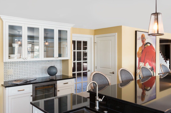
“Does THAT really go with THAT?!”…I’ve heard this question from my clients more times than I can count. Now don’t get me wrong, I will not make a suggestion that takes a client out of their comfort zone until I fully understand their personal aesthetic preferences and requirements for their spaces. But often we get stuck in a rut or caught up in “Garanimals for Interiors” as I like to call it. The horrified look that accompanies this question is sometimes enough to make me want to back off completely from the suggestion that produced it. But clients don’t hire me to give them ordinary, average coordinated spaces…they hire me to present fresh ideas and help them find that edge where their comfortable, established personal style lives in harmony with the risky, unexpected and awesome.
Our eyes and brains understand colors, textures and shapes by contrast. Without it, everything in life is unremarkable. But our brains also crave connections between the elements we see. This is one of the challenges we face as we intentionally design. Those connections can be made while using the contrast of design elements producing an unforgettable space. It is our human tendency to focus on individual elements. But to appreciate and buy into this concept of connected contrast, you must be able to see it as a whole in your minds eye. Helping my clients visualize the end result is as much my job as creating the look. Without getting them to “see” it before it’s done, I cannot expect them to be on board. That’s important to me because I only move forward with a unique concept after I have my clients confidence and trust in where we are headed.
Examples of the connected contrast I speak of can be illustrated with textures, colors and shapes and general design style. Such as polished and stained concrete floors used with rustic wood bar elements in a restaurant. The finishes clearly contrast by texture, but if you give the concrete an organic pattern and color we can also connect them by nature. Polished brass cabinet hardware with gray kitchen cabinets is another example. The cool tone of the gray cabinets contrasts to the warmth of the brass hardware, but by choosing a hardware style that echoes the clean lines of the shaker style cabinets you have now tied them together and set them apart simultaneously. Take this example….combining raw wide plank rustic wood flooring with rich formal furnishings in a living space. Many of you have opened up Architectural Digest to see exactly this. That floor has a soul and history as do the formal antique furnishings, this is the unifying factor in the room. The contrast factor comes in via rich velvet upholsteries in vibrant colors next to the raw natural wood tone of the floor. Pairing a clear acrylic chair with a natural wood tone desk and shaggy white rug in a home office also illustrates this concept. By selecting similar clean lines in the molded pvc chair with a mid century style desk, we create a style connection where a material contrast exists. The texture and placement of the rug ties the two elements together and softens the clean lines. When this balance is accomplished, design elements maintain their own identity while harmonizing perfectly together.
Is design juxtaposition for everyone? Absolutely not. This is why it’s so important to me that I get to know my clients style personality and comfort zones as we work together. By working in layers on projects, we can address the visualization and comfort zone challenges faced with every client. This also helps build trust with my role and the design plan we’ve established. I start with basic elements that my client feels confident selecting such as flooring, paint colors and cabinet design. Then we build on that by adding subsequent layers incorporating details and furnishings that may take them to that edge. Sometimes this is done in one phase, but most times it’s done in two or more. Giving my clients time to live in their spaces before we add those additional layers helps them understand what will work best in their world. It’s important to weave these unique touches into the entire space rather than randomly throwing in one. Tossing in an individual unexpected element in a room can easily look like a mistake. Incorporate them sparingly throughout a space and the design becomes dynamic feeling intentionally unintentional. The bottom line is this, every project is different and every client is unique. Which is what makes my job so challenging and fun. It’s also why every client deserves to explore the special design touches that reflect their personalities and style preferences. I enjoy discovering what gives each client joy and seeing those ear to ear smiles as the plan we’ve created comes to fruition….with beautiful, unexpected, connected contrast.


